Monday, November 24, 2014

Random Gamers Guild Work: Kaprosuchus

Kaprosuchus is an extinct genus of mahajangasuchid crocodyliform. It is known from a single nearly complete skull collected from the Upper Cretaceous Echkar Formation of Niger. The name means "boar crocodile" from the Greek κάπρος, kapros ("boar") and σοῦχος, souchos ("crocodile") in reference to its unusually large caniniform teeth which resemble those of a boar (from wikipedia)

Matt Hargenrader tasked me with rendering my version of the Kaprosuchus for his upcoming project on Kickstarter.com tentatively entitled "DWELLERS IN THE DEEP PLACES"

I had no idea what a Kaprosuchus was prior to the assignment, maybe I have been hiding behind the drawing board too long, how could I have not know what this amazing creature was?

Essentially a giant crocodile with long legs and "boar-like" tusks. Sounds nasty right! So I did the cursory search of the internet and found several decent images, but one in particular struck me. It is a Getty Image and at risk of any copyright infringement I will simply put the link here.

Pretty amazing right...how am I to top that?

Well I first start with a preliminary sketch. Sort of "getting the feel" for how the thing is shaped. I keep everything rather loose, and try and get a general feel for the creature. 


I try and get the pose right first, as that is (to me) the most important part, I cannot move on to parts and pieces until the pose it right. I wanted to get him circling on himself initially and so I came up with the above. 

Still it is not perfect. The legs were too short, the tail wasnt right and the head wasn't perfect, but it gives me a starting point at least. It needs a lot of refinement for sure. I am sort of satisfied with the curvature of the neck, and the right "arm", The body needs bulk, and the legs need to be extended. 

I also think that the neck is too short, the snout is too short and not quite gnarly enough. So go to the light box (generally i tape the image to my dining room window and trace the parts I am most satisfied with).  And I come up with these changes. 


Here you can see I adjusted the body quite a bit, stretched him out and was playing with the positioning of his tail a bit. I elongated his legs, neck and snout and have his head nearly the way it will be in the final illustration. 

I am happy with the general position and pose at this point. There is still some tweaking to be done though. For starters the left arm still doesn't look right to me sort of short and the angle is wrong, not only that but it doesn't seem to support his weight. I initially thought that maybe it would be raised, ready to take a step, but I needed to use that leg, especially in this pose for support, so that there was balance to the image. 

The right arm is almost to where it needs to be. The rear legs are looking pretty good to me, but the body needs more bulk, and the spines to either side of his neck and back need more detail. 

Once again I paste the image onto the window and do a quick tracing. 

Once the tracing is done onto the final surface in this case thick smooth Bristol board the inking can begin. 


Here you can see the inital inks, I am choosing at this point where my light source will be, but the initial line work can be done while I am considering this. As you can see I enlarged the lower tusks, fixed the issue with the spines along his neck and back, and have the fore legs in their final position. 

The tail too is outlined and about where it will be in the final. I gave his under sections some definition and bulk, and started to layout his scales. 

From here I will make my way through the line work, choose a light source direction and get into the heavy inks. 


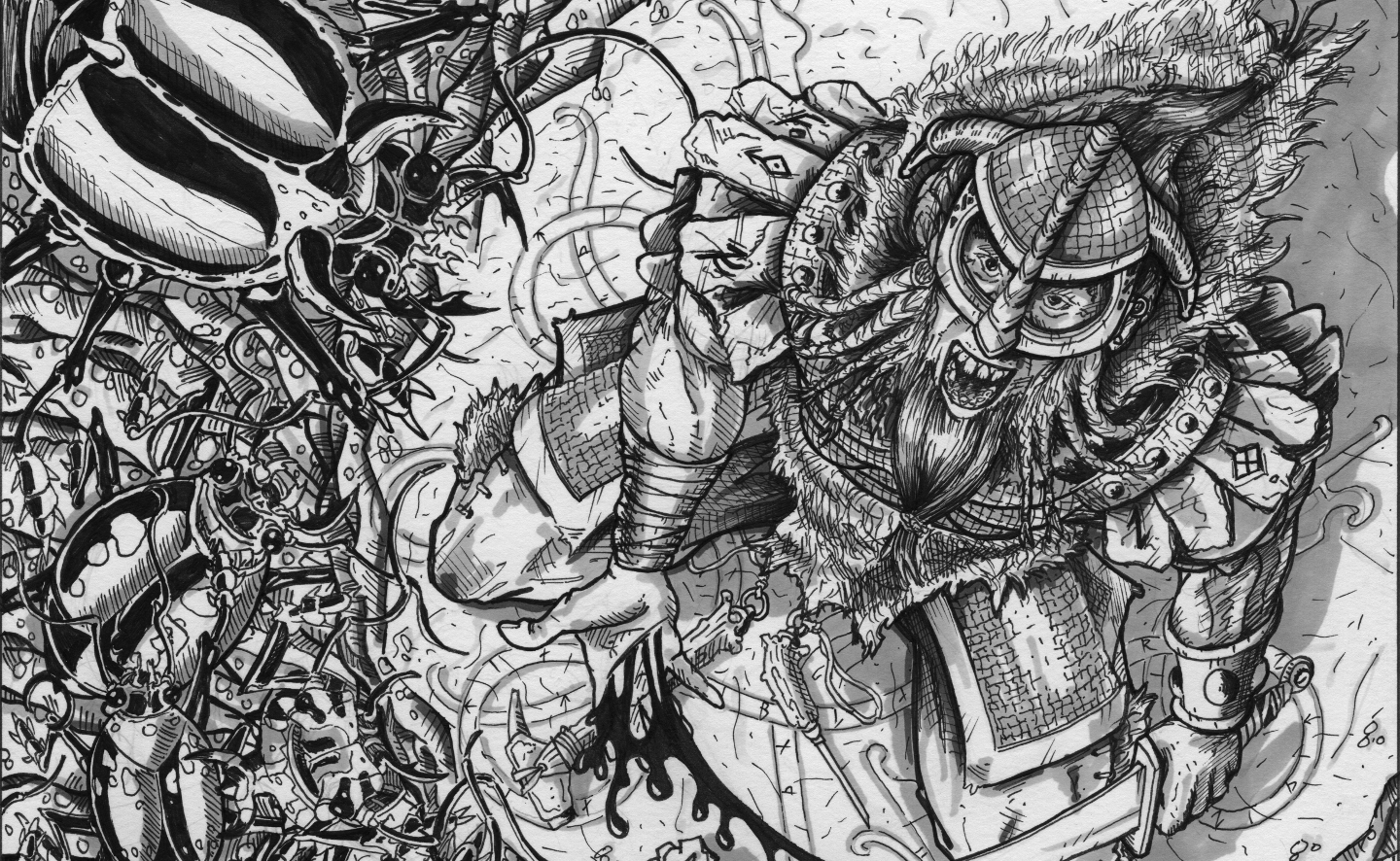
Well it is done. I used a goodly amount of darkness on his underside, and gave his hide a tough bumpy look. This was a fun illustration to do, and I am trying to constantly perfect my techniques. 

Does this look over worked? I always worry that these look like a jumble of ink marks on paper. There are always things I think I could have done better. Let me know what you think in the comments below or on G+ or facebook.com/Mavfirearts.


Thanks for looking, comments always welcome.  


Thursday, November 20, 2014

Random Gamers Guild Work: Granite Asp

I am continuing to showcase my completed work for the Random Gamers Guild and Matt Hargenrader. The product will probably be called "DWELLERS IN THE DARK PLACES" and be available near the beginning of the year. It is a creature catalog of sorts. Check it out and back it on Kickstarter.com when you see it. 

This one is the Granite Asp!

I started off wanting to make this snake a stone like construct, and but wanted to add him to an environment as well. I scoured the interwebs and found a decent image of some granite columns of the roman era. They were perfect. 

Looking at them I was noticing the texture of them, and it really stood out to me that they were really pitted and streaked with darker colors. I don't get the opportunity to do a lot of ink dot work, so I thought this would be a great way to get it out of my system. 

Copyright Del Teigeler 2014. Licensed to Matt Hargenrader.

I am quite pleased with the fluted column, and the way the snake wraps around it. I feel like I was able to accomplish blending the Asp in, but keeping him separate as well. The textures are what make it for sure. 

I imagine torch light bouncing off of him in the dark corridors, and unsuspecting adventurers thinking "that's a nasty looking column" then....WHAM! the Asp attacks. (insert maniacal laughter here.)

Thanks for looking, and comments always welcome. 

Tuesday, November 18, 2014

Equijubus for AS&SH: Predator and Prey

Finally a finished piece for AS&SH RPG for the upcoming supplement "Forgotten Fane of the Coiled Goddess" by +Joe Salvador

This is the docile Equijubus dinosaur, a herbivore that roams the jungles. It is hunted occasionally by the Linyi Tribesmen for their hide and their flesh. 

I thought i would represent these two together, predator and prey. 

Equijubus Dinosaur Drawing
Copyright Del Teigeler 2014. Licensed North Wind Adventures LLC.

I hope you all like the progress on these dinosaurs, I am really enjoying this project. 

Well, back to the drawing board. 

Thanks for looking, and comments always welcome. 

Monday, November 17, 2014

Random Gamers Guild Work: Dhi'Awan

I have been busy working on several projects at once, the first of which I have posted many of the illustrations I have been doing for Astonishing Swordsmen and Sorcerers of Hyperborea, that product should hit Kickstarter within the first month of 2015. The second is a monster manual entitled "Dwellers in the Dark Places" for the Random Gamers Guild and publisher Matt Hargenrader.

He has contracted me to do several of the monsters that will appear within that tome, probably due out after the first of the year. Sorry I do not have specifics as of yet. But keep checking in here for details. 

The first monster is called the Dhi'awan and I first worked up sketches of this amazing creature. 

Copyright Del Teigeler 2014.

The concept carried through to the final inked version. Matt wanted the wings to be more "bat-like" so those were changed before going into inking. 

Overall I am very pleased with the final ink version, and I equally hope that Matt is pleased with it as well. 

Copyright Del Teigeler 2014. Licensed by Matt Hargenrader.

I really worked the blacks and shadows into to the scales and the "soft" under belly of this guy. I think the contrast between the underside of the wings and the exterior of the wings are pretty good. I don't suppose I would like to run into this thing, pretty nasty. 

More to come!

Thanks for looking, comments always welcome. 


Thursday, November 6, 2014

Village of Deeping Well work...

An undisclosed project I am working on has me drawing for a village called Deeping Well. 

Here is some of the work I am doing for it. 

The first will be a page holder image of the actual "Deeping Well", and shows something coming out of the well. 

(Click to Enlarge)

This image will accompany page numbers and probably be a part of a larger format image that borders the pages. 

This next sketch is a concept for the town overview. I wasn't very happy with how it initially turned out, and I scrapped the idea, but couldn't let my efforts go completely to waste so here it is. 

(Click to Enlarge)

I initially want the village to be propped up on a hill, and there was going to be a dragon in the foreground. This may be turned into a reference when the cover work begins. But for the initial village layout it just wasn't working. Over all I am pleased with the way the buildings came out. 

I also wanted to scale the size of the village down, the concept got started and then I realized the actual village would be much smaller. 

This next illustration will be an interior map of the village. I have some tweaking to do, but for the most part this will be the way the town is laid out. A somewhat typical fantasy village. 

(Click to Enlarge)

This project has taken a back burner to two other projects that the due dates are rapidly approaching, but I didn't have a whole lot of progress on either of those projects to post, so I thought I would let these out of the bag. As it has been almost a week since my last post, and I don't want to give up on this blog thing. Life just seems to leap out of the bushes and attack sometimes. 

Let me know what you think!

Thanks for looking and comments always welcome.