Friday, August 29, 2014

Goblin Warrior Final

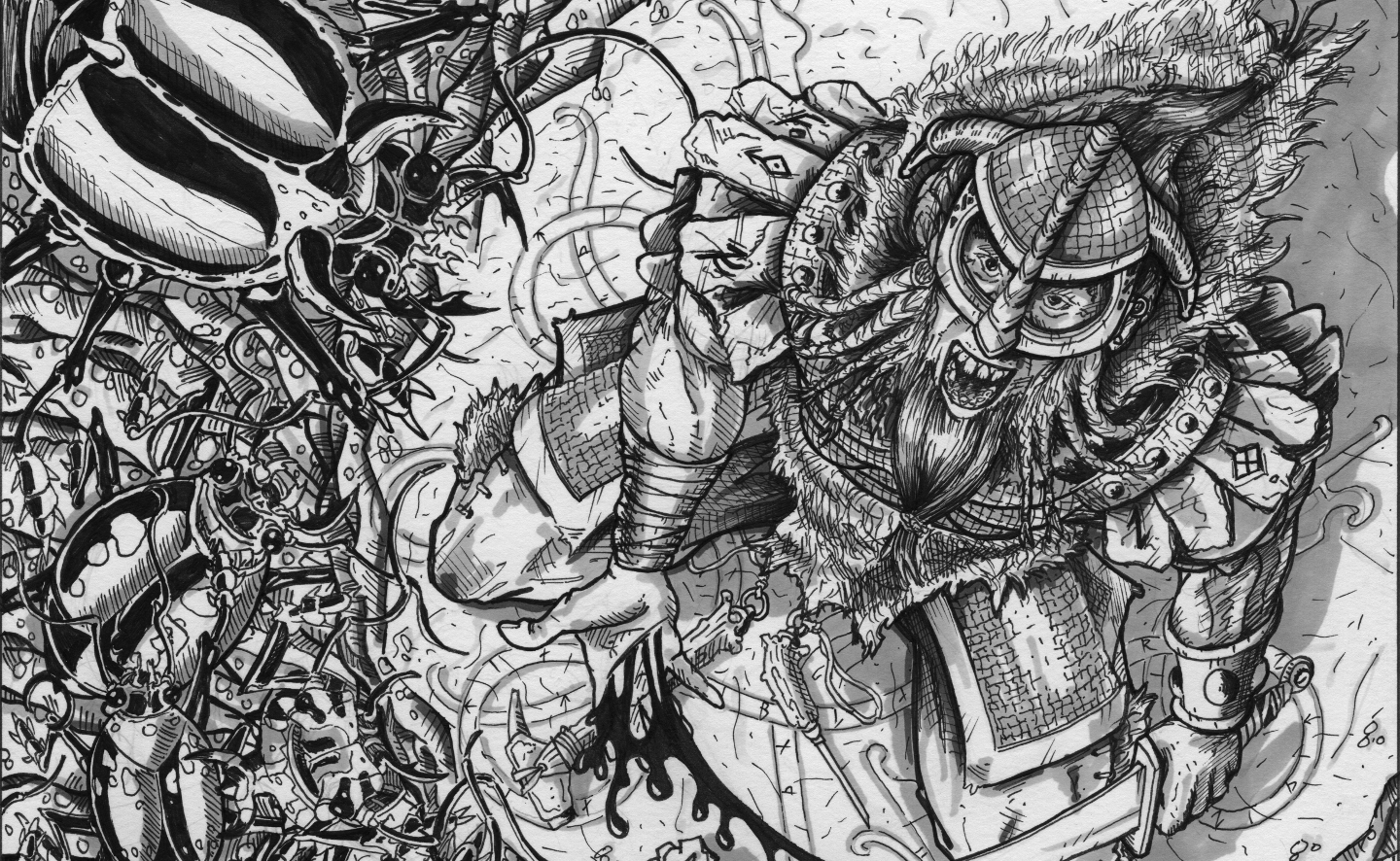
Got up this morning and finished my Gobo at Work sketch. Inked it in and used Prismacolor neutral grey markers to finish. 

It took me a few minutes to work in the floor pattern. I have done stone floors in the past on Kobold Shaman and Jaguwere, but wanted to go for something a bit different for the gobo. I figured him standing on a sandy/loam floor with remnants of human bones would be a good "backdrop". 

I worked on shading again, and used some of the techniques I began to hone on Resting Orc, and expanded on them with my use of grey markers. 

(Click to Enlarge)

Looking closely at the drawing you will see I went to great lengths at showing veins, grit and wrinkles without going overboard (at least in my opinion). I used my wood grain technique on the shield made from dungeon door boards, and worked on a rust technique I picked up from Mark Crilley (an illustrator who produces youtube videos on "how to draw") for both the broken sword and the warthog jawbone.

I think it is vital for any artist to continue to learn, and I am finding it easier and easier to pick up helpful hints along the way to make my art work that much better. 

Thanks for looking, and comments always welcome. 

Tuesday, August 26, 2014

Have some stew my pretty!

Started this last night, and then finished it when I was woke up at 0330 this morning for an emergency call. When we got back I could not return to sleep, as I think she was calling to me. 

 I wanted to create an old crone offering a bowl of porridge. I have been thinking on this image since I read one of the articles "Gaming Gourmet" that & Magazine will be publishing in the future. The title was "Brunswick Stew". Of course my brain instantly struck upon the thought that this was no ordinary stew.

While still in the sketch form, I am quite pleased with the overall feel of this illustration. Again this was scanned at work on an office scanner, so the quality isn't the best.
(Click to Enlarge)

I actually cannot wait to get home from work and ink this one in. 


Thanks for looking, comments always welcome

Friday, August 22, 2014

Resting Orc Final

Diligently working on this since my earlier post. Wanted to finish it up, and I don't feel like I rushed it either. The weight of the inks definitely is felt in this final illustration. I really worked the shadows in, making sure that they fell in the right places to compliment the overall coposition. 

I am quite pleased with how it turned out in the end. I have yet to decide whether I will leave it black and white or add in my grey-scales, as you may have seen in some of my other artwork here on the blog. 

(Click to Enlarge)

If I could have figured out a way to illustrate sweat and grime I would have, he feels a bit too pristine for as tired as he looks. It is something that I will have to continue to work on. Each time I pick up the pencil or pen I feel like I must set out to do something better. While I didnt accomplish the fabulous quality of Frank Frazetta I will continue to strive toward such lofty goals. 

Thanks for looking, comments always welcome. 

Resting Orc Process

After taking a brief hiatus to spend some quality time camping rustic style with my two boys, I am returning to the drawing board. I apologize for my absence, and am ready to get back into the swing of things. 

During the camping trip I kept getting flashes of this worn out orc resting, perhaps after a battle or just on guard duty. It could be that after carrying a 70 pound backpack through sandy terrain over the course of several miles I was exhausted and was contemplating someone who felt like I felt at the time.  

I wanted to be able to confer the feeling of how it must feel to be theses humanoids pushed outside the realm of humans, to have to live in a world where you are hated, and in turn where you project your hatred upon human civilization. 

Here is the quick thumbnail sketch I did, roughing out the ideas. 

(Click to Enlarge)

I wanted him to have a sense of weight to him, hunching his shoulders and resting his forearms upon his knees. He had to look fatigued in my mind. He needed to have a look forlorn as well. He had to be "pig-faced" as that is my classical OSR memory of orcs. I felt he needed to have some armor on but I didnt want to so overly burden him with armor that the details of his figure were completely removed. 

I took a break and looked over a ton of Frazetta paintings, and after looking at them I knew I wanted to work on the way the orc's muscles and body looked. I didnt want to copy the masters work, but if I could improve my characterization, body mechanics and shape and composure of the illustration, I figured I might as well learn as I go. 

I started inking it today, and thought I would get some "work in progress" posts up.

(click to enlarge)

Rather than drawing on top of the original thumbnail (which I normally do) I redrew the image and worked it from ground zero so to speak. I increased his hunched over look, and changed the bench to a rock, though I may change that too. I am wanting to drop in some heavy shadows, but wanted to work the textures of him first. There is something about the way he is seated with his feet overlapping that I feel makes this "feel" natural. 

Back to the drawing board to finish it. I will post up the final inks before I add in the grey marker work, for the final piece. 

Thanks for looking, comments always welcome. 


Wednesday, August 13, 2014

Fantasy building sketches

It really intrigues me to draw the exteriors of fantasy buildings, and I am sort of on a kick right now. The Isometrics I have done in the past have been rather popular in the G+ community and I like giving the reader of my blog what they like. 

Recently I have been doing alot of sketches of building exteriors and have been scanning the web for other artists who also do such. Deviant Art has some fantastic examples of fantasy buildings,a nd a quick google search has led me to many others. 

Whether it be a birds eye view of a cityscape, or just the outline of a straight on view I am not sure what it is that intrigues many of us old school role players about fantasy cities, buildings and floorplans. Its like a inlet into a world that we wish we could have lived in. Looking at the images created for us to explore unknown environments that we personally could never go to. 

Mostly used as background for a larger campaign, cityscapes are a link to the immersion into that wider world of our imagination. All this being said, I thought I would post up several quick sketches, I am not sure if these will ever be completed and published, but for me they were a fun outlet. 

(Click to Enlarge)

This first one was just a study sketch. I wanted to get loosened up so I just started drawing stacked boxes and then added roof lines and then the common "Post & Beam" /"Timber" frame buildings. Woking in a slight birds eye and using 2 point perspective without the use of T-square or straight edges. 

(Click to Enlarge)

For these next few studies I looked at an illustration piece by Yun Hyun Jung and picked up some valuable line placement tips by copying his drawing. Remember working off someone elses artwork is fine, it teaches you where they decided to place lines, and allows you to figure in your own head where your lines will go, so that they make the most sense visually. This is not tracing, mind you, and never claim the work as your own, always site what you looked at. 

(Click to Enlarge) 

(Click to Enlarge)

This building study was taken from the same study piece as mentioned before. I liked the multi-faceted building with plenty of angles, additions and roof lines. It made this a challenge but it was fun to work it all out. I inked this one up to work on my pen work. 

These final two are some of the pieces I was working on for & Magazine for an underground city. The first was a sketch that I was working on but gave up after the tower near the center came out leaning. The second was nearly  finished when I saw +Christopher Letzelter 's awesome piece that appeared in issue 10. His was obviously better than mine and so as art director, it was an easy decision which one to choose. 


(Click to Enlarge)

(Click to Enlarge)

Thanks for looking, comments always welcome.


Wednesday, August 6, 2014

Gobo at work

At work for 5 days straight (in between answering emergency calls for service of course) is a good time to work on some concept sketches for the "Humanoids" issue of & Magazine

This little guy came out of my Dixon Ticonderoga "soft" pencil, as freely as ever, which surprised me as usually at work I have a bit of artists block. Perhaps it has been the 36 hours straight working at the fire station that has the creative juices kind of in a blitz. Either way I thought I would share the early concept sketch.


After a bit of post production work in Gimp 2, he looks about as good as a scan on a office scanner gets when done in light pencil. 

I will eventually ink him in, make the staff look more like a natural stick, and improve the look of the warthog jawbone piece strapped to the top. I may hunch him over a bit more, bringing his center of gravity more over his scrawny legs, and add a few more details to the ramshackle shield. 

Not sure if I will leave him barefooted, or wrap his tootsies in leather rags. 

I actually like the broken rusted sword on his hip, and I may bring that around to the front to show off it's detail a bit more. I dig his head, and especially that goblin smile. Huge nose, pointy ears, gangling and sinewy arms and legs and that should complete him. We'll see...maybe he is just one of a group that will be the final illustration. 

Thanks for looking, comments always welcome. 

Monday, August 4, 2014

Three Shops Cover

      The editors of & Magazine are putting together a compilation of the article Three Shops by Jeff Bowes       with illustrations by me. When originally published the isometric shops proved to be of too low a resolution to be of much use to players and DM's alike. We are hoping that the re-release will fix this issue, as the three isometric floor plans will be bigger, and a better resolution.
      
As such we needed a cover that would illustrate what was in the small suppliment. I came up with the following. It was a stretch for me to do color, and I think it was worth it. I am going to save my comments, and I wait to see what the community at large thinks. 


(Click to Enlarge)

Thanks for looking and comments always welcome. 

Saturday, August 2, 2014

BBQ Meatballs Finished....

Just a quick post. Wanted to show progress on the BBQ meatballs illustration for & Magazine issue 10 due out in mid August. This will accompany an article that is entitled "Gaming Gourmet" and delivers tasty real recipes to gamers. 

(Click to Enlarge)

I hope you like it. 

Thanks for looking and comments are always welcome. 


Friday, August 1, 2014

Excelling at wood grain...

I have been told that my technique for illustrating wood grain in black and white is very good. Many times I have been told that the wood grain back drop, whether it be a background, table detail or simple element of a drawing often outshines the actual illustration itself. While that is not a great thing, it speaks loudly about the wood grain effects I produce. 

It also allows me to highlight some of my drawings that have not graced my blog, and since time is so essential, and I have not had a post in some time, I thought what the hell. 

Here is an illustration of a drunken dwarf, that I did as filler art for & Magazine, but has not been used. Notice that the end grain of the wooden table is all that is seen. 

(click to enlarge)

In my opinion it is not the actual rings in the end grain that make this effective, but the cross hatch of the saw-blade that was used to cut them. It gives them that touch of reality, if you will. 

The following illustration demonstrates well the view of wood grain, this was
 published in & Magazine issue 7
(Click to Enlarge)

The table top is in forced perspective, and very weathered. This was done with pencil and with black prismacolor colored pencil. The weathering effects are what really make this stand out, in my opinion. I tried to vary the areas where the knots were as well, so that they were not all nicely lined up, and the pattern of the grain follows very specific patterns.

All grain flows around a knot, so depending on where the knot is located, for example the knot on the far left board is in the middle section of the board. I start there and work flowing lines around it until the space of that board is done. Typically a board will be cut to its length along the grain, so all grain flows lengthwise. Conversely it will be cut for length across the grain. 

Aging the ends of the boards in this illustration was very important, it gives a very weathered feel, and the aging cracks always follow where the cupped end grain of the boards are. Again I cross hatched the ends of the board to show the saw blade effect. 

This table was over used in some Armorers shop so you can see tool marks, not only on the surfaces, but also on the edge, where the man either filed his work, or cut it with implements. 

Overall  I am very satisfied with these pieces, while writing this blog post I realized that subconsciously I think about wood and wood grain way too often. 

Thanks for looking, comments always welcome.