Wednesday, November 2, 2016

Astonishing Swordsmen & Sorcerer's Runegraver

We are deep into our second week for the AS&SH kickstarter for the 2nd edition of the game. Only 18 days to go, and it is funded beyond the first 8 stretch goals, and less than $300.00 away from $50,000 which means +Jeff Talanian can commission more artwork for the already busting at the seems book!

For those of you thinking that this second edition is going to be a different game, it is not. In the infamous words of +David Prata it is the same game; 

The hardcover Second Edition includes new classes, spells, monsters, and magic items. Errata have been incorporated, and ambiguities clarified, but no substantive rules changes have been made. This Second Edition is not a wholly new game to be learnt; it remains fully compatible with the AS&SH original edition boxed set.

As I have said before, this book will add a ton of new artwork, by Charles Lang, Val Semeiks, Russ Nicholson, Jonathon Bingham, Daisy Bingham, Jason Sholtis, Peter Mullen, Glynn Seal, Logan Talanian and yours truly. 

While those of you who have already pledged have seen this, perhaps some of you have not. Here is a new sub-class for the game; the Runegraver. 

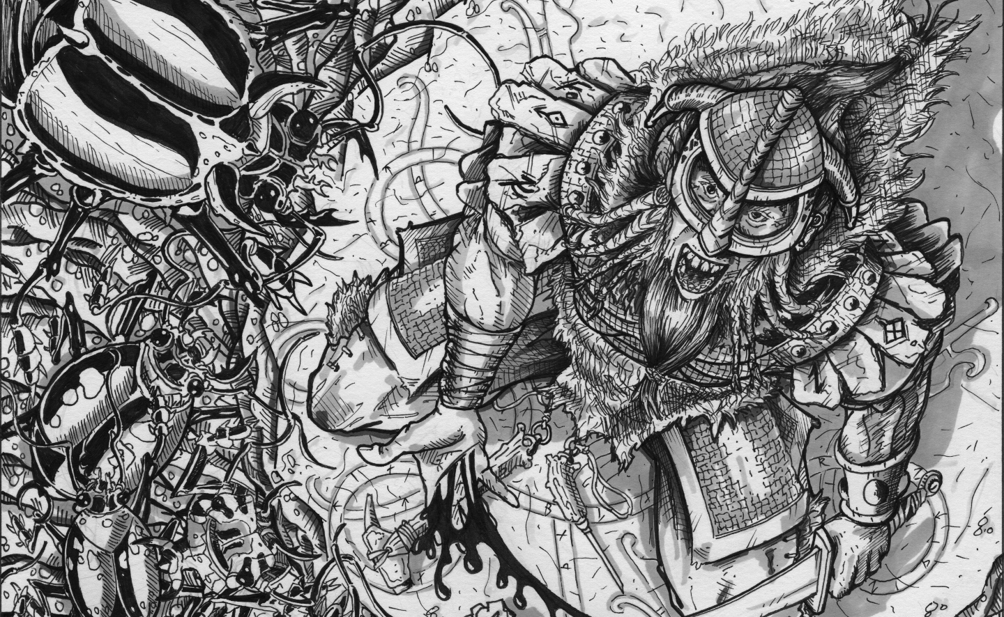
"Runegraver: a mystic warrior who carves runic spells on bone, metal, stone, and wood"

This started off as a few rough sketches, some of which can be seen here.

The rest of the process is detailed here. 

First the beginnings of the full sized rough. 

Here I have detailed the rungraver, and a few of the critters. Even this will change as I try and pack as many of those beetle into the scene. 


Starting the inking process. I nearly always start out with the face, especially if I have it the way I like it, as in this illustration. These wont be finished inks, just light weight inking at this stage. 


I really strove to get a feel for depth in this one, and as I started detailing the tomb, and several other items, this was beginning to show through. I also have roughed in his hands, and most of his shoulders, and some of his waist area. The perspective here, really hides the majority of his body, and that is a critical thing that has to happen in order to show it from this sort of angle. Never worry about losing part of the figure's body, unless you are drawing straight on, you never see all parts of the figures body. 

Ouch, he may have cut himself here. 


Oh, the creepy crawlies are coming in now. Again, I didn't worry about not seeing every little bit of the bugs, I knew that most of their bodies and legs would be hidden by the outcropping of rock that he is perched upon. All of the line work for the tiles on the floor is almost complete here. I like all of the little details, the brick, the tiles, the tight runic carvings in the tomb, it is what keeps me interested. It's a lot of work, but with the music going it goes by pretty quickly. 

I have to admit I started to itch at this point in the drawing, bugs just tend to do that to me. 


Opps, this view is angled wrong, but I think you can see the progress that is being made here anyway. Just the beginnings of the beetle in the lower left corner (lower right in the final), ready to pounce on our Runegraver before he finishes his incantation. 

From the previous image to this one, I have filled in the final bits of floor, it is imperative when working in ink, that everything that is in the foreground is done first. Once ink is on paper (Bristol), there is no going back. So once I got the beetles on the edge of the cliff done, I was able to fill in the details below. 


This is the final progress shot I took, for the most part everything is fleshed in. All the beetles are there, in various stages of completion, and the stone stairs are being engulfed by the horde. In the final you can see that I added some more carvings to the floor area  under the Runegraver, and finished this whole thing up with my grey wash. Incidentally this was the last piece I did with Prismacolor markers. 

Which spell is he casting? I will refer you to this website, and see if you can figure it out!

I have switched my technique to actual ink washing now, it is more like painting, I can get a variety of hues, mixing it myself and the brush I use is a Pentel Waterbrush so it is easy to dilute as I go. I will have to detail that process in a future blog-post. 

For now I think that has wet your appetites, now go out and pledge your support for the kickstarter. 

Thanks for looking, comments always welcome. 

Friday, October 7, 2016

AS&SH Hardcover: Huntsman WIP and final, Plus Kickstarter is coming soon!

It seems that I have not been able to get blog posts up as frequently as I had at one time desired. Much of what I am doing now is work that publishers do not want to be let out to the general public...yet!. I love showing off my art to those of you who appreciate it, but without the generous publishers, and their desires, I would not be doing what I do. 

That all being said, many of you know that +Jeff Talanian's  Astonishing Swordsmen & Sorcerer's of Hyperborea 2nd Edition is going to Kickstarter soon. (And if you don't...please do yourself a favor and crawl out from under that rock...I hear giant spider demons live under those) 

This is going to be a huge tome of a book, and being in on the gory details has me salivating already. I have been tasked with a ton of art too (Class pictures, monsters, and comic style panel art) which is a good thing. On top of all that, I am in unbelievable company with this project.  

There are many artists that I admire including the works of +Jason Sholtis +russ nicholson Val Semeiks, Charles Lang(cover), John Bingham and Peter Mullen. They have all been signed on to provide art for the book to go along with the fantastic art of +Ian Baggley. I have also seen amazing cartography work by +MonkeyBlood Design (Glynn Seal) and I have to say wow (Large Wall Sized Map in Color)!! Glynn is doing some amazing work right now, and his AS&SH work is going to be spectacular!!

On to the art and process!

I shared only a portion of this in a previous post, but I wanted to get a concept to final post up for the Huntsman, a new class for the game. 

What is not shown here is the many gorilla images, ape images and other ref material I went through in order to capture the pose and expressions of all the pieces involved. I also was unable to grace you with pictures of me posing for the huntsman, so I could get the pose just right, trust me when I say you are not missing anything.  

This first is the thumbnail rough to get the feel for the action. I initially wanted to see the front of the ape thing, but that defeated the purpose of this being a illustration about the huntsman. If you cannot see the face of the subject, then the subject is not the subject if that makes sense. A viewers eye is pulled to the face of the critter and it is completely forgotten that this is a picture of the warrior. So I had some re-thinking to do. 


What that meant was that I had to take all of the reference images and try and show an over the shoulder shot of the ape. Those photos do not exist, so I had to begin visualizing the apes head from over his shoulder where the viewer would be. This image is the first rough from this angle. 


Progressing on the ape here is the pencil work on the final Bristol Board where the final inks will be laid down. You can see that for the most part everything was tidied up and then his body was beginning to take shape. These are basic guidelines laid in, in pencil just to get an idea and as a reminder to which direction all of that fur goes, and the creatures expression.


Here we have the whole scene coming together. We have the over the shoulder shot of the ape being thoroughly skewered by the Huntsman, whose face you can begin to pick out. There are rough images around the page representing things that might appear in the foreground and the background. This established depth. The huntsman's mount is in the background as well, a sabre-toothed tiger, seemed appropriate. 


Inks are getting fleshed out (excuse the pun) and now the ape critter is nearly completed. I key here I have found is that I usually work from foreground to background, especially in inks, in pencil it doesn't matter quite so much. 


Now we get to our hero...so to speak. The huntsman has stabbed the ape under the arm pit, making it holler out. You can start to see some of that Hyperborean architecture in the background at this stage too, and the sabre-toothed tiger is beginning to materialize. 


Here is the final image. You can see everything complete now. I purposely wanted the garb of the huntsman to be sort of thrown together, representing the many kills he has made over the course of his career. Look closely you can pick out boney plates, furs, tusks, skulls, talons, and all sorts of "trophies" from his previous kills. I also wanted to illustrate the point that he not only employs the spears for his kills but also a bow. (Extra credit goes to those who can pick out where he started his hunt from...here is a hint his bow still rests there)
Huntsman by Del Teigeler
Copyright Del Teigeler 2016 for North Wind Adventures.

The statue of Apollo, disfigured and broken, remnants of ruins on the hills, the moons of Hyperborea, plinths, obelisks and debris all over the place. This was a fun image to work on, and only one of the ten class pictures lined up for the world of Hyperborea!

The anticipation for the AS&SH 2nd edition is palpable among the social sites of the inter-webs, and if you have not joined in on the superb quality and fun that is the Astonishing Swordsmen & Sorcerer's of Hyperborea game system this new book is a great way to hit the ground running. Be sure to check out the Forums for the game and get in on some of the conversations. 

Thanks for looking, comments always welcome. 


Friday, September 30, 2016

Mystery at Port Greely Illustrations

I have just recently added all of the illustrations for "The Mystery at Port Greely" to my deviant art page. 

Including this medalion: 

If you have not checked out the module yet, you can purchase it in all its splendor at the following sites: www.drivethrurpg.com , www.rpgnow.com , and www.hyperborea.tv

I also have several of the original illustrations available for purchase; if anyone is interested email me for price list.

Here is the list:

Rejuvenation Chamber (fish-man bath)
Kthulhu Medalion (seen above)
Fishmonger's Ring
Marsh at the Gourd
Thief on a Stone Shelf
Hyperborean Lighthouse
Esoteric Order of Mother Hydra Doorway


Thanks for taking the time to look. 

Comments are always welcome.

Sunday, August 21, 2016

Review and Plug: Golden Eye of the Kobold King

+Steve C of Hogtown Games and dndborderlands.blogspot.com recently published his first S&W compatible digest sized adventure. Congratulations Steve! Steve asked me to design his games company logo and you can check the evolution of the design here. 

I recently received a hard copy of this adventure that is for 6-10 characters of levels 1-2 and read through it. It is a nicely designed and laid out little module. 

Here is the front cover.

The logo I designed is at the bottom centered and it stands out and represents everything that Steve wanted. It looks nice. Reminds me though that I have to send him a version that is not on a white background so that it doesn't pop out so much. 

The cover is nicely laid out, with the title clearly at the top and prominent and in a read-able font. The image, while stock art is a nice fill for the front. I love modules with a black cover, and when highlighted with ink art it just makes my heart thud! So rarely do we see modules these days with simple black and white ink art. (Or maybe I am not looking in the right places?)

Here is the title page.

Again the Hogtown logo is prominently displayed in the center of the page and Steve even credited me with its design there. Thanks Steve!

I really like the layout of the entire book, and while I don't have photos of the rest of it, it is easy to read, the stat blocks are well done and organized and the maps that are inside are very utility and fit within the pages well. I should note that the "pay-what-you-want" version does not include interior art, and the one I printed from lulu does not have interior art either. Still it doesn't subtract from the quality of the modules writing and interesting storyline. 

The back cover reads:

"On the fringes of civilization , beneath a great dark cliff at the end of the Forsaken Gorge, loom the Dread Caves of Doom. Greebok the Kobold King occupies the Dread Caves of Doom, using them as a base to launch raids into the civilized lands. Bolstered by his war band, and the aid of a strange enchanted device known as the Golden Eye, Greebok appears unstoppable, and the frontier lands doomed to fall under his murderous rule. 

Will the daring advenuturers answer the call to launch a preemptive strike on Greebok's outpost in the Dread Caves of Doom and finally stop the merciless Kobold King? Or will they simply kill the Kobold King, loot his stuff, and ride off to the next dungeon? Are these aims mutually exclusive? Heck no!

However, Greebok and his war band are not the only threats, Hidden within the Dread Caves of Doom is an ancient alien tomb with weird technology, and the crypt of a ghoulish alien noble driven mad by endless years of undeath. 

Enjoy the mystery and death in ....

GOLDEN EYE OF THE KOBOLD KING!"

Here is a pic of the back cover:

Intrepid adventures are lead through a Wilderness Gorge where Rabid Jackals and Giant Centipedes (among others) maraud before getting to the Caves entrance. Getting into the cave is just the start of the devious tricks and traps that the Kobold King has in store in this 13 room adventure that will surely captivate new players and veteran's alike. I plan on running this for my children in the near future!

Soo.... if you are starting off with a new group of 1's ad 2's after a TPK go ahead and head over to your favorite online publisher like lulu.com or check out the pdf version at RPGNow.com It is listed at pay what you want but it is well worth a hefty donation!

I just want to thank Steve again for his patronage and in selecting me to design his games logo. It was a fun project and a great diversion from the stuff that I usually work on. 

Steve also contracted me for a few more illustrations here and here that will hopefully be joined in print with this logo. 

Thanks for looking and comments always welcome!

Wednesday, August 10, 2016

Rough work: Sketchbook

In an attempt to get back on schedule and to put some of my really rough work up here on this blog, I am sharing some more sketches. 

This first one was done while sitting in an seminar for work. I am a firefighter and sometimes certain sects of firefighters call fighting fire "slaying the dragon". A bit ambitious of those who call it that. Also, I wanted to show an old timey fireman in the scene as well. This started out as a doodle, and kept progressing until this stage. As of yet incomplete. It may never be finished. 


This next one is for a current project. I often play with different head wear, hairstyles and tattoos, to create the right look of the character that is being drawn. This is an example where I just copied the same head lightly and then added details to the copied head to see what looked best in the overall drawing. The nice thing about these, is they were at 100% scale, so I just cut them out and slid them over the original drawing so that I could see the concept head on the completed drawing. I chose the lower right one, but changed it a bit.

For these next few, I was playing around with barbarian concepts, and sketched this guy out. Problem with this one is that you cannot see the front features of him, still I like the hunched look and may use this in a future project. 


This one is another barbarian, I liked the action of it, and the cestus on his hand, but again when shot from the back you are not able to see his features. 
For these next two they were concepts for a new class in AS&SH really rough at this point, but I was trying to get the perspective and positioning right for the final image. It really helps to do a bunch of these little "thumbs" to get things right before putting them on final bristol with ink. 

Here is another of the same subject with a different set up. Again I am just working on the perspective of the main subject, so you can see I was playing with having him stand, or kneel and you can see several feet/lower legs that I was working with. 
This final one is a warrior figure holding a sword and perhaps attempting to cast a spell. For the most part only the head and sword arm were used in the final image. 
Alright, well there you have a glimpse into some more process pieces. I plan on putting up more final pieces as soon as the majority of the hard copies of AS&SH the Mystery at Port Greely arrive at people's door steps. I dont want to spoil anything. 

Thanks for looking, comments always welcome. 


Sunday, July 3, 2016

May and June: Low production months.

I want to start out by apologizing to all of my friends out there. I should have given all of you an update a month ago. I went dark for the month of June and part of May.  I had a lot going on. Here is the list of stuff I have been doing. 

I am an active violence trainer for the entire Lansing MI area Fire and Police Departments. During the past several months a majority of my off work time has been spent training first responders in response to active violence incidents. With the rise of incidents in the USA and other parts of the world an increase in awareness is necessary. That took up a ton of my time these past few months. 

I am also persuing a permanent Fire Officer position with my current Full Time occupation with the Fire Department. I have been acting as a Fire Officer for the past three years due to vacancies but we have a rigid examination we have to go through to ensure we are properly trained and ready to work in that capacity. That took up the rest of my time off, studying, and preparing for the assessment. I passed the written and the assessment portion in a top spot, and should be promoted within a few months. 

I have two boys who were involved in Travel Baseball. Each of them played in multiple double-headers, and multiple single games a week. We were often stretched in all ways at once.. It was a grueling season, but we came out with winning teams for both of them. 

Glad that June is over. Now I can get back to a steady regimen of drawing which I assume is what brings the majority of you here anyway.

I am still working on 10 illustrations of the different classes (two of which were compete at the end of May) for +Jeff Talanian and North Wind Adventures; Astonishing Swordsmen & Sorcerers of Hyperborea Hardcover, and Jeff Gratiously granted me a leave of absence from the drawing board the month of June. Unfortunately I am under a vow of silence and thus cannot post up any of the images for the hardcover book until Jeff's say so. He runs a tight ship. Which is a good thing it keeps me in check, as I would spoil everything if it were up to me. I will also be tasked with many more illustrations for the hardcover as well, so that should keep me busy over the next half year or so.

However, there should be some movement on The Mystery of Port Greely Kickstarter. I know that it has been in editor +David Prata 's hands and is probably real close if not at the printer. So I should be able to post some pics of that artwork soon. 

I also did a huge isometric tavern/inn for Troll Lord Games. Which I will get up on here soon. And I am working on another project for them as well, that should see the light of day early next month. 

Needless to say I am anxious to get back to the drawing table again, and really get some things cranking. 

Now for the news. (If you are still reading this, that is.) 

Matt Hargenrader's Dweller's in the Dark Places has been published at Drivetrurpg.com.

Thanks for supporting that project. Matt is super awesome to work for, gave me a work out with all the oddities he had me cranking out. Here are just a few of those to wet your appetites. 
Di'awan detailed here.

Asp, Granite detailed here.

Ice Drake detailed here. 

Wide Wouthed Asp detailed here.

Kaprosuchus detailed here.

Andrewsarchas detailed here.

 Haldroon detailed here.

Xanniz Worm detailed here.


I promise to get this blog thing going again, if not for my sanity than for your pleasure!

Thanks for looking, comments always welcome. 

Monday, May 2, 2016

Tenkar's Tavern and the John Buscema connection

When I made a comment supporting +Jeff Talanian's Mystery at Port Greely Kickstarter on +Erik Tenkar's blog. Erik immediately contacted me and asked for my rate sheet. Once given he pretty much left the rest to me. 

For this project, I knew I wanted an exterior view of the Tavern. That part was simple. 

I started working with three point perspective and that got me the basic view I was going for. Establishing the horizon line at about the split between the 1st and 2nd story of the structure. I also knew that I didn't want it facing the viewer directly.  I wanted a wall, a road and some buildings in the background to show depth too.


A problem I came upon immediately was trying to figure out how I could get some contrasting blacks into the image. A little back story here; I love the works of John Buscema and Alfredo Alcala's in The Savage Sword of Conan on the old magazine sized Conan comics. He really set the tone for what Conan would look like. I am more impressed with his use of blacks, and tone than any other of the artists who were brought into the series. 

I have the collected volumes and I refer to them from time to time for ideas such as line work, use of contrast, composition and a wide range of artistic approaches. You can really glean a ton of information from these awesome tomes. 

As I was flipping through volume 2, I came across this image in the Haunters of Castle Crimson Story Chapter VI. 
(Photo taken by artist. All copyright Dark Horse Comics)

I really love the use of blacks, and the hatching done in the walls and buildings. Now, let me be clear, I didn't want to completely steal this image. I just wanted to convey the same feel, and concept. The use of black ink to "frame" the overall image was what I needed for the Tavern piece. 


I marked in the blacks and it gave that depth and feel I wanted. 

Then came finished inks, and details. 

(Copyright Del Teigeler 2016. Image owned by Erik Tenkar of www.tenkarstavern.com)

I am pretty happy with the way it turned out really. I always struggle with going to black, and obviously my work in no way compares to Buscema/Alcala but I think you can see a bit of Homage to the look. 

 I really encourage anyone who is interested in black and white artwork to pick up at least one of the volumes they are really cheap and will allow you to learn from a few of the masters!

I want to thank Erik Tenkar for his patronage, and invite all of my readers to go to his blog, comment, and participate! Maybe you will see this Mast-head during your stay there, and remember this story!

Thanks for looking, comments always welcome.

Friday, April 22, 2016

The Sketchbook...

I have been so busy with all the projects that I am working on currently that I just have not had time to get a blog post up. I dont want the lose sight of my goal with this blog, which is to give some insight into what I go through as an artist in the niche field of "Old School RPG's", and to continually try and improve all of my artistic skills along the way, and sharing all of that with you select readers of this blog. (You do actually read this, and not just look at the pictures right?)

Since the Port Greely Kickstarter has funded and all my art obligations are complete. YEA!! I have moved on to the AS&SH hardback. 

I have been tasked with several of the Class pictures, as well as thinking about which monsters I would like to illustrate as well as "some" magic item and other fill pieces. There is no real timeline for this, though I really do not want to be the last artist working on it, and feel like I am holding the project up. +Jeff Talanian is such a stand-up guy and so easy to work with, that I would hate to have him waiting on me.

Thus far I have finished initial concept sketches for several Classes, and from those have generated pencil work for a few more, (which I will not be showing...yet, no spoilers here.) Though here are a few initial concepts. 


On top of that I am drawing an eight level isometric for Shinobi 27 Games and +David Fisher of a castle for an upcoming adventure product. This one is real fun too, lots of round towers....try drawing isometric circles....talk about a brain twister. Really they are ellipses, but ellipses have to be perfect or they look like footballs, and no-one wants a football shaped tower.  

Here is a sketch of that, no spoilers as this is just a pencil of an initial sketch, it has been changed dramatically since.


In addition my trip to Garycon netted me more isometrics for the Castles & Crusades System by Troll Lord Games. This is an extreme closeup for a project, with finished inks. More ellipses...yikes!


And, if that were not enough projects on the burner, I was contacted by none other than +Erik Tenkar of Tenkar's Tavern (actually I posted something to his blog, and he in turned asked for a mast-head for his blog) that I have just finished up. 

Here is the initial sketch. I will put up the finished one once Erik releases it to the public on his blog. 


As it is I am able to work on several projects at once. See Isometrics really take a toll on my brain. Although I have to admit that they are getting easier as I have trained my brain to think in that perspective. I also started doing all of the shading digitally in GIMP, and with my small somewhat useless Wacom tablet, it goes much faster that way. 

Life gets really busy for me during the spring time, as both my boys are playing travel baseball, and with practices and what-not it doesn't leave a lot of time for sketching for me, and with all the other drawing I do, I like to keep my sketching going, keeps me in practice while I am on the road, at work or just waiting for an apointment. I use a 4x8 inch Barnes & Noble sketchbook mostly for all my "on-the-go" sketches. 

 Here are a few quick sketches while sitting at practice. 


And we took a rare day in the 70's in April in Michigan to go to Holland state park, and laid on the beach, not one of my past times, but the wife and kids love it. So here is a fantasy version of the Holland Light. 


Not the best drawling I have done, but it kept me from going insane on the beach.


Well there you have it. Not much in the way of finished products, but those will come in the future. Hopefully that wets your appetite until I am able to release some more finished project details. 

Stay tuned. 

Thanks for looking, comments always welcome. 

Monday, March 28, 2016

More Port Greely

Less than a week left for +Jeff Talanian's "Mystery at Port Greely" kickstarter for the AS&SH campaign setting. 

Many of the pledge levels that have some of my original illustrations have been selected, and I want to thank those of you who read this blog who have contributed at those levels. There are still a few left, so if you have not gotten in on the action do so now. 

I have a whole stack of new artwork projects from Mr. Talanian, to include many of the new classes for the 2nd edition AS&SH hardcover book. That should hit kickstarter sometime after the completion of the Port Greely one. Stay tuned here for more information. 

Here are a few more drawings from the kickstarter. 

This first one is the fish-man bath. Look out for the fish-sticks! (Say that fast!)

(Copyright Del Teigeler 2016)

These dudes were enjoying a nice salinized bath, snacking on crustaceans, chewing on smokey lotus, and dreaming of their dark god, when your party of adventurers so rudely interrupted them. Will you become their sacrifice?

This was a very fun drawing to work on. I started off with a quick concept sketch.
(sorry about the orientation I could not get this to flip regardless of what I did)

Then after increasing the size of the pool to match the written description I moved to inks on bristol. 


After that I started heavy hitting the ink. 

(sorry about the orientation I could not get this to turn no matter what I did.)

Greys came next and I worked the background darker, and added a few tridents on the walls. 

I am real please with how this turned out, and I hope that one of you picked it up with the kickstarter. 

Thanks for looking and comments always welcome.